Platform Branding
What is Platform Branding?
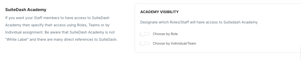
Platform Branding is the process of customizing the platform with your preferred colors, logo, and settings.
Customize with your Brand
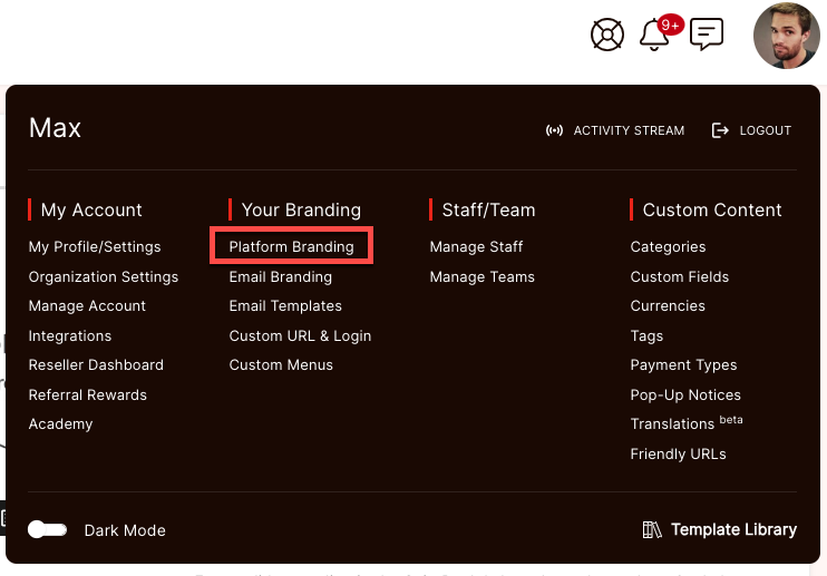
You can find Platform Branding in the Fly-Out Menu, by clicking on your profile image in the top-right of the screen. There you will find many options for setting custom background and text colors, as well as an option to use a custom logo for your account.
Logo and Preset Themes
This section allows you to pick a pre-made theme for your platform style as well as upload both Standard and Dark Mode logos for Desktop and Mobile.
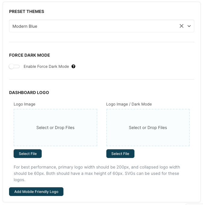 Preset Theme: We have created a collection of pre-styled themes for you to choose from that best fits your brand and style. You can also customize the theme further so do not worry if it is not just right :) this is just to get your started.
Force Dark Mode: Enabling this option will force Dark Mode for all Users of the Portal. It will also hide the option to disable Dark Mode in the Flyout Menu.
CLICK HERE to learn about Dark Mode
Dashboard Logo: This logo is the main logo that you will see on the left side menu. You will have an option for the Standard theme and the Dark Mode theme that can be enabled on each individuals account. For best performance, we suggest that your custom logo image be 200px wide, and have a max height of 60px.
Mobile Friendly Logo: This is the logo that will show when the left side menu is collapsed or on a mobile device. You will have an option for the Standard theme and the Dark Mode theme that can be enabled on each individuals account. For best performance, we suggest that your custom logo image be 60px wide, and have a max height of 60px.
Font Themes
Font Themes provides you with an extensive selection of fonts to personalize your Portal's typography. The integration with Google Fonts makes it easy to select and apply fonts, along with their available styles.
 Whether it's headers, paragraphs, buttons, or other elements, you have the flexibility to choose fonts that align with your brand identity and enhance readability.
Use the Dropdown in the Font Family box to set the Font for Primary Headers, Secondary Headers and General Text.
You also have the option the Headers and text should you wish to return it back to the default option.
Primary Elements Styling
This section configures the main view of the platform. You will be able to see any changes you make in real-time.
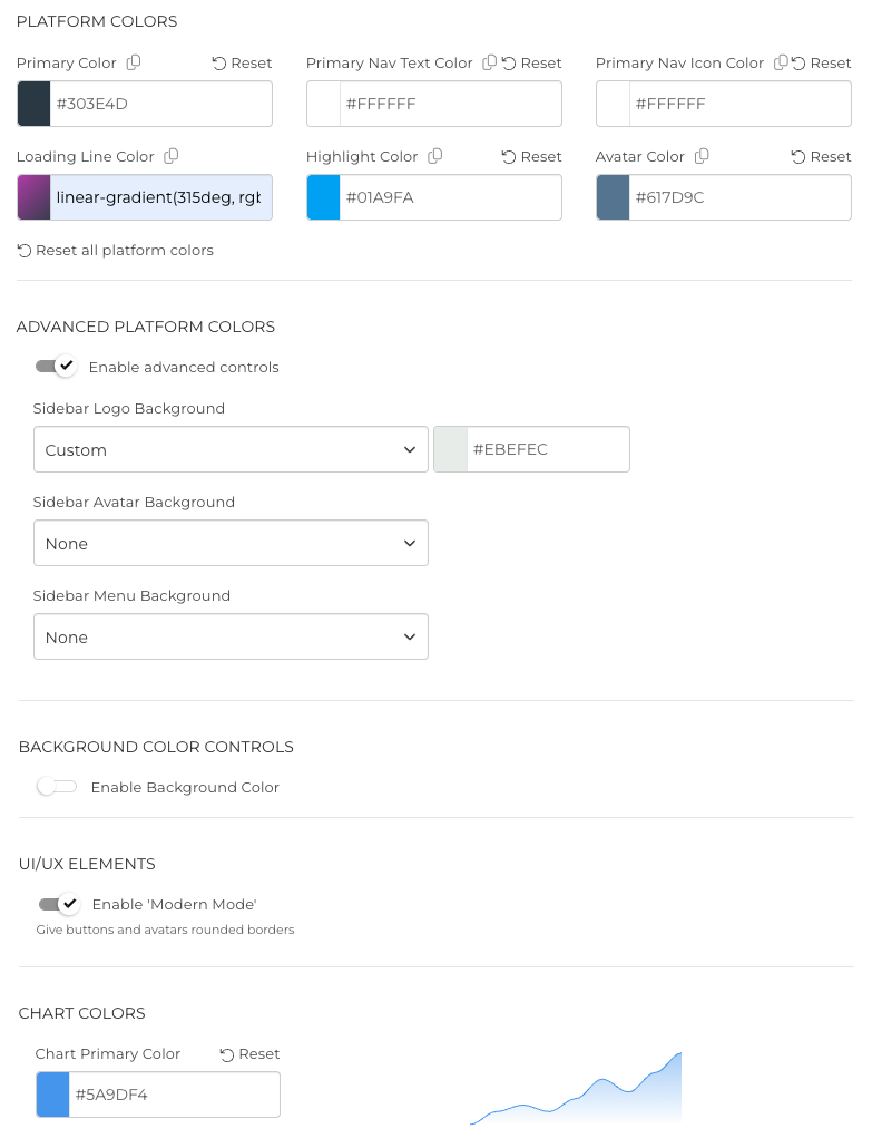
The Platform Colors options control the side navigation bar (Dashboard, CRM, Office, etc.) that remains static regardless of what page you are on. This setting will control the background color (dark blue by default) of this navigation bar.
Primary Nav Text Color: This setting controls the color (light grey by default) of the text in the Main Navigation.
Primary Nav Icon Color: This setting controls the color (light grey by default) of the icons (such as the logout icon, the help icon, etc.) of the Main Navigation.
Loading Line Color: The loading line is a thin colored line that will appear at the top of the page when you click save or are loading a new page.
Highlight Color: Some words are highlighted in the system and you can select your preferred highlight color. The highlight color in this example was changed to orange;

Avatar Color: Customize the color of the Avatar. The User's initials will be shown in this color if you do not add an image for the avatar. The avatar is located on the top right of each page of the portal.
Advanced Platform Colors: Toggle this switch to ON for additional options.

Background Color Controls: Toggle this switch to ON for additional background color options.

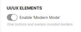
Modern Mode gives your buttons a more rounded look and turns avatars from square to round.
Platform Background + Liquid Glass Effect
Enabling the Platform Background + Liquid Glass Effect will change the main content background to an image of your choosing. Content that needs to be visible above the background image will be shown over a semi-transparent Liquid glass background.

Platform Background Image: This will be the image that shows as the primary background behind the majority of pages in the platform. For best results width should be around 2560px and max-height should be around 1440px. File size limit is 2MB.
Platform Background Image / Dark mode: This will be the image that shows as the primary background behind the majority of pages in the platform but only when Dark Mode is enabled. For best results width should be around 2560px and max-height should be around 1440px. File size limit is 2MB.
Title Color: This will set the color of the text for the main title of a section. Please see the example below.
Description Color: This will set the color of the text for the description text of a section. Please see the example below.
Shadow Color: This will set the color of the background or glass effect of the Title and Description sections. Please see the example below.
CLICK HERE to learn about Dark Mode
Toggle the switch on the Enable the setting. You can then select a file for your background and set your Title, Description, and Shadow colors. Here is an example of how the Liquid Glass effect looks with a busy image in the background:

Account Confirmation Page
When a user is invited to the platform and they click the link to set their password this is the page that will be displayed.
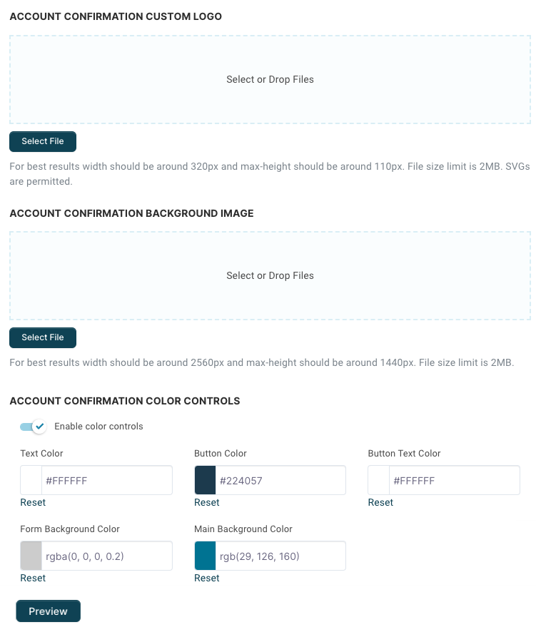
You can upload a Logo and/or a background image.
For best results we recommend Logos to be around width 320px and max height of 110px.
For Background Images (to fit the entirety of most screens without distortion) we suggest that the image be at least 2560px in width, with a max height of 1440px.
TIP: If an image is not uploaded, and you do not add a Main Background Color, by default the background will default to Blue.
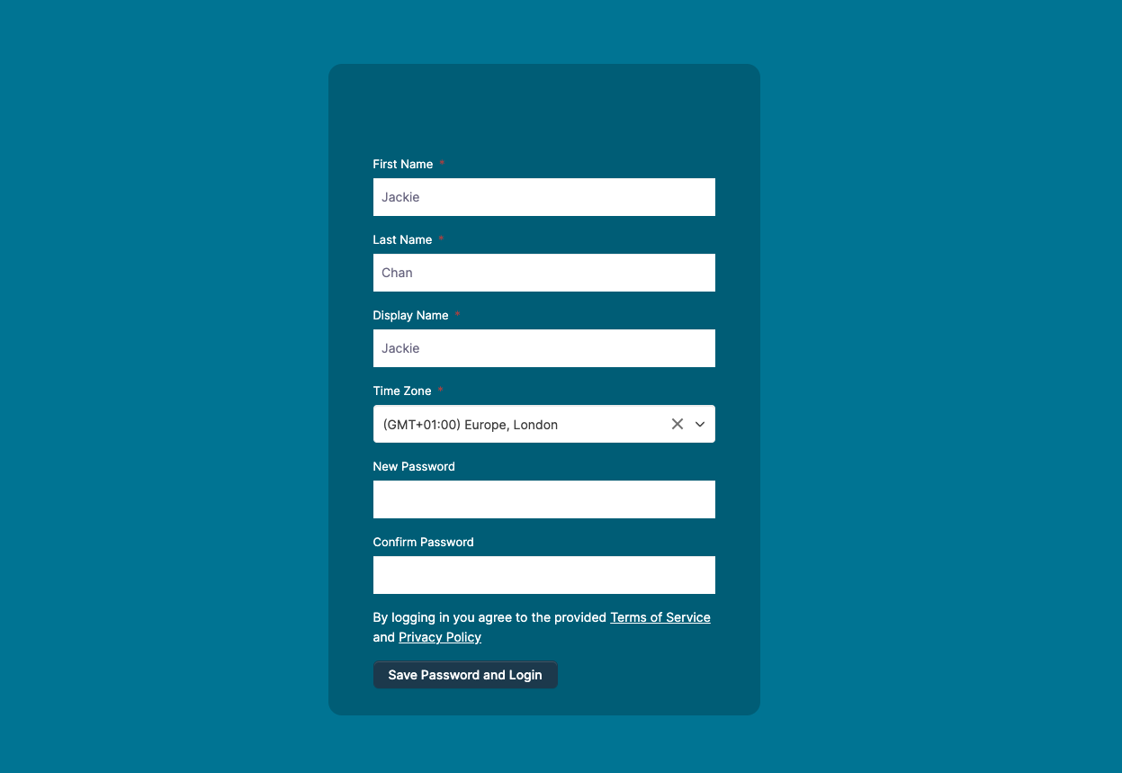
Text Color: The color of the form text (First Name, Last Name, etc.)
Button Color: The color of the Save Password and Login button
Button Text Color: The color of the Save Password and Login text that appears on the button
Form Background Color: This is a box that appears behind the form to improve the readability of the form text. In addition to the color, you can also set the opacity.
Main Background Color: This is the colour of the page background if no image is uploaded.
While adding your colors and branding you can Preview the Account Confirmation Page by clicking the Preview button.
Custom Page Loader
Customize the graphic that is displayed during page loads. This can be either an animated image or a static image.

Changing the color and background color will display the changes in real-time and can be seen applied to the selection of default loaders.
Loader Color: Choose the color of the image.
Background Color: Choose the background color that will display. The opacity level will only be shown along with the Background Animation.
Background Animation: Once the page has loaded, you can set how the background disappears.
Loader Width: The width dimension that you would like the graphic to be displayed.
Loader Max Width: Set the percentage of the graphic width for cases when the screen size is smaller than required. This is to keep the graphic proportions consistent.

You can choose from a variety of default loader animations. Or, you can upload your own custom image by selecting the first icon. Supported file types are JPG, JPEG, PNG, SVG, or GIF.
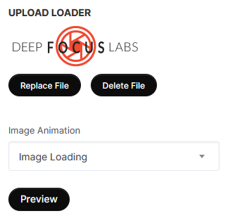
Uploading an image overrides the other customization settings. However, you can apply animations to your loader to spice it up!
Choose an Image Animation from the dropdown menu. You can choose Static Image if you do not want any effect applied.
If you want to create your own unique Custom Loader to use but don't know where to start, you can click HERE for a vetted resource.
QR Code Styling
Customize the look of the QR Codes used within the platform. You can add a custom logo, customize the dots style and color, and more!

QR Code Preview: Get a real-time preview of your customizations. This is how your QR Code will look throughout the platform.
Main Options
 Under the Main Options card you can set the Width and Height of your QR Code. The Width and Height are in px.
You can also set the Margin of the QR Code, this will give your QR Code a little extra space around the edges when saving as a PNG or SVG. Margin is in px.
You can drop a custom image here as well. This will place the image in the center of the QR Code. Perfect for matching your brand!
Dots Options
 Under the Dots Options card you will find settings to customize the style and color of your main dots.
Dots Style: This sets the overall style of your dots. You can choose from Rounded, Square, Dots, Extra Rounded, Classy, and Classy Rounded.
Color Type: Set the color style you wish to have on your dots. You can choose from Solid or Gradient.
Dots Color: This field will set the color of your dots. The options will vary depending on your Color Type setting.
Corner Square Options

Under the Corner Square Options card you will find settings to customize the style and color of your three corner squares.
Corner Square Style: This sets the overall style of your corner squares. You can choose from Default (no setting), Extra Rounded, Square, and Dots.
Color Type: Set the color style you wish to have on your squares. You can choose from Solid or Gradient.
Corner Square Color: This field will set the color of your squares. The options will vary depending on your Color Type setting.
Corner Dot Options

Under the Corner Dot Options card you will find settings to customize the style and color of your three corner dots.
Corner Dot Style: This sets the overall style of your corner dots. You can choose from Default (no setting), Square, and Dots.
Color Type: Set the color style you wish to have on your dots. You can choose from Solid or Gradient.
Corner Dot Color: This field will set the color of your dots. The options will vary depending on your Color Type setting.
Background Options
 Under the Background Options card you will find color options for the background of your QR Code.
Color Type: Set the color style you wish to have for the background. You can choose from Solid or Gradient.
Background Color: This field will set the color of your background. The options will vary depending on your Color Type setting.
Image Options
 Under the Image Options Card you will find options to adjust the image that was uploaded in the Main Options card.
Hide Background Dots: Enabling this option will hide the dots that are directly behind the image.
Image size: This setting adjusts the size of the image in the center of the QR Code.
Margin: Adjust the amount of space around the image. This may be most noticeable with the Hide Background Dots option enabled.
Advanced
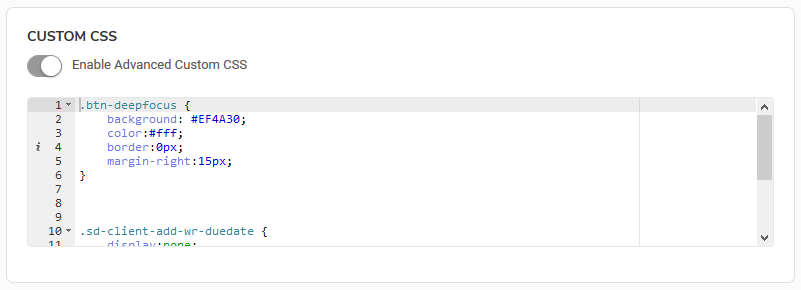
You can use Custom CSS to further your customization by toggling the switch to ON and inputting your code.
CLICK HERE to read more about Custom CSS Snippets
Both Custom CSS and Custom JS are inserted just before the close of the body tag.