
BLOCKS: Icon Block
Icon Block
The Icon Block is a block type available in the Content Block Editor that lets you display a Font Awesome icon directly on a page or portal. You can use it purely as a decorative visual element, or attach a click action to it such as opening a link, revealing content, or triggering an Automation.
The Icon Block follows the same interaction patterns as the Image Block, so if you are already familiar with Image Block click actions, the Icon Block will feel immediately familiar.
What This Block Is Used For
Use this block wherever you want to add visual icons to a page or make an icon interactive for your Targets. It is a flexible tool that works well for both decorative and functional purposes.
- Display a visual icon to enhance the layout or design of a page or portal
- Create a clickable icon that links to an internal or external URL
- Use an icon to show or hide other content on the page
- Trigger an Automation when a Target clicks the icon
- Add interactive elements to a portal without needing a full button or image
How to Add an Icon Block
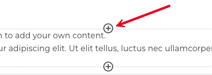
1. Open the Content Block Editor on any page where blocks are supported (Dashboards, Portal pages, Landing Pages, Profile Pages, Documents, Proposals, Campaigns, Lessons and Sales Funnels).
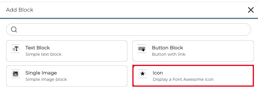
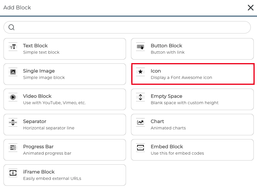
2. Select the Icon Block from the list.
How to Configure an Icon
Inside the Icon Block settings, you can configure what happens when a Target clicks the icon. The available click actions mirror those on the Image Block:
- None - The icon is purely decorative. No action occurs on click.
- Open Link - Clicking the icon opens a URL. You can choose to open it in the same tab or a new tab.
- Auto-Template - Clicking the icon triggers an Auto-template.
- After Limit is Reached - The icon is displayed and clickable until it has been clicked a set number of times, after which it is hidden automatically.
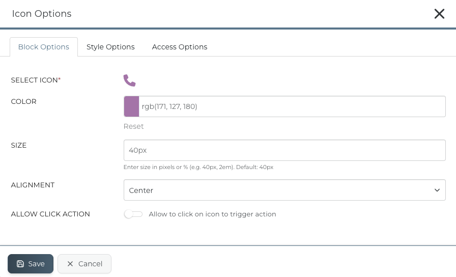
1. Once added, the Icon Block edit panel will appear.
 2. Use the icon picker to browse and select a Font Awesome icon.
 3. If you are purely adding the icon as a decorative visual element, you can then choose your color, size and alignment and click save.
How to Configure a Click Action
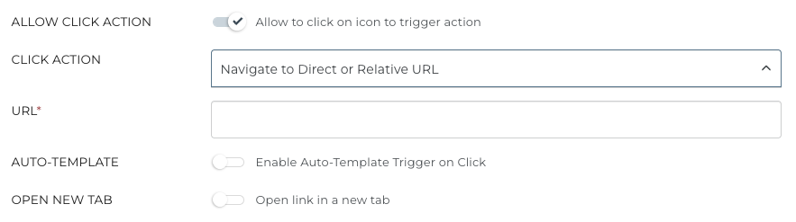
If you would like to attach a click action to the icon such as opening a link, revealing content, or triggering an Automation, tick ' Allow to click on icon to trigger action' and select the relevant option from the click action list.
You can now add a URL to direct the Target to.
Can I Trigger an Automation from an Icon Block Click?
Yes. You can attach an Automation to an Icon Block click action. When a Target clicks the icon, the selected Automation will be triggered automatically, no additional setup is required beyond selecting it in the click action settings.
To trigger an Automation, turn on the 'Enable Auto-Template Trigger on Click' option and select an Auto-Template. You can also create a Success Message if required.
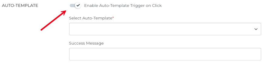
In addition, you can limit the number of times a Target can click the icon to trigger the Auto-Template. Click 'Limit the Number of Triggers/Clicks' if you would like to set a specific limit which can be Based-On a static number or a number Custom Field.
 You can also select what happens after the limit is reached.
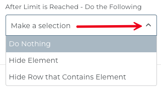
TIP: When using the After Limit is Reached option, the icon will automatically disappear once the click limit is hit. Make sure this is the behaviour you intend before publishing your page.
CLICK HERE to learn about Auto-Templates.
What Users Will See
Targets with access to the page/block, they will see the Font Awesome icon you selected, displayed within the layout. The experience is clean and intuitive:
- If a click action is configured, the icon will be interactive and respond when clicked.
- If no click action is set, the icon appears as a static visual element which is decorative only.
- The icon inherits any styling you have applied, including size, colour, and alignment.
Best Practices
Used thoughtfully, the Icon Block can make your portals and pages feel more polished and intuitive for your users.
- Use recognisable Font Awesome icons so Targets immediately understand what the icon represents or does.
- If attaching a click action, make it clear to users that the icon is clickable - consider pairing it with a label using a Text Block nearby.
- Use Show / Hide Content to create accordion-style expandable sections, keeping pages tidy without removing useful information.
- Test all click actions before publishing, particularly Automation triggers, to confirm they behave as expected.
- Use the After Limit is Reached option for one-time actions (such as a welcome interaction) where the icon should only appear the first time.
TIP: The Icon Block works especially well alongside the Button Block and Image Block when building interactive Dashboards and Portal Pages. Mix and match these block types to create engaging, action-driven layouts for your Clients and Staff.
RELATED ARTICLES
CLICK HERE to learn about the Content Block Editor.
CLICK HERE to learn about all Block Editor Block Types.
CLICK HERE to learn about Auto-Templates.