
Content Block Editor
What is the Content Block Editor?
The Content Block Editor is a tool to make creating content for Dashboards, Portal Pages, Landing Pages, LMS, Proposals and Document Generators easier. Using Blocks, you can insert, rearrange, and style content with very little technical knowledge. It's as simple as just adding a block instead of having to deal with coding.
As a special feature, you can assign Blocks to Circles. This way you can have multiple Contacts view the same Dashboard or Portal Page, but it will only show the relevant information for each. This same feature also gives you the option to hide Blocks from Circles.
Where to find Content Block Editors?
To use the Content Block Editor in a Dashboard, navigate to Content > Dashboard.

Either select an existing Dashboard to edit or click the button + ADD DASHBOARD to create a new Dashboard.
If you are creating a new Dashboard, first add your Dashboard Settings and click save and then you will be taken to the Dashboard and the Content Block Editor.

CLICK HERE to learn about Dynamic Dashboards
To use the Content Block Editor in Portal Pages, navigate to Content > Portal Pages.

Select either select an existing Portal Page to edit or click the button to create a Portal Page.
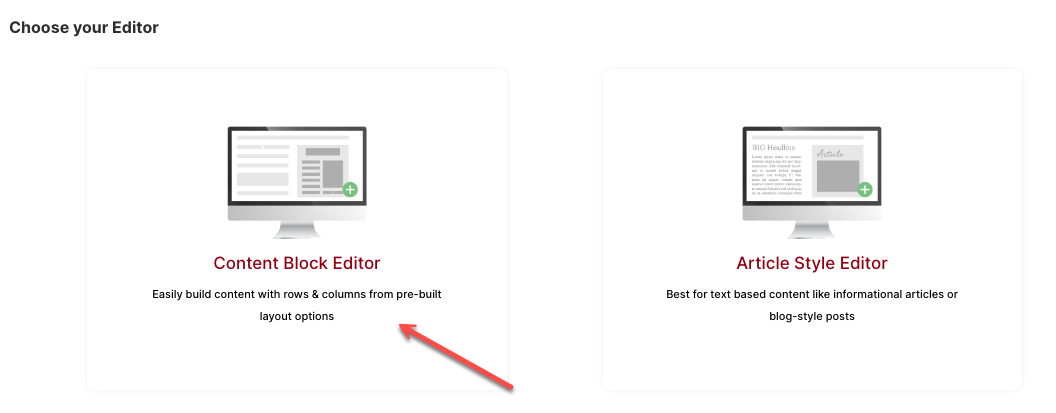
If you are creating a new Portal Page, choose Content Block Editor in the Choose your Editor section.
CLICK HERE to learn about Portal pages.
To use the Content Block Editor in Document Generator, navigate to Office > Documents.

Click the Generator tab in the top navigation menu bar.

Select either an existing Generator to edit or click the + ADD GENERATOR button to create a new Document Generator.
If you are creating a new Generator, choose Content Block Editor in the Choose your Document Type section.

CLICK HERE to learn about Document Generators.
To use the Content Block Editor in a Landing Page, navigate to Content > Landing Pages.

Select either an existing Landing Page to edit or click the button to create a Landing Page.
If you click + ADD LANDING PAGE button, you will be required to add your Page Options and click save, then you will be able to build your page with the Content Block Editor.
CLICK HERE to learn about Landing Pages.
To use the Content Block Editor in LMS Courses, navigate to LMS > Courses.

Either select an existing Course to edit or click the button + ADD COURSE to create a new Course.
CLICK HERE to learn about LMS.
When you are creating or editing a Course, whenever you create a Module, you can then click the + icon to add a lesson via a Content Block Editor.
To use the Content Block Editor in a Proposal, navigate to Office > Proposals.

Either select an existing Proposal to edit or click the button + ADD Proposal button to create a new Proposal.
If you click + ADD Proposal button, you will then select to add it Direct to the CRM Target or to create a Generator to use it in Automation.

CLICK HERE to learn about Proposals.
The Content Block Editor is also used to build your Proposal Templates. To create Page or Full Proposal Templates, navigate to Office > Proposals and select the Proposal Template option from the Proposal dropdown options.

CLICK HERE to learn about Proposals Templates
To use the Content Block Editor in a Document Generator, navigate to Office > Documents.

Click the Generators tab on the top menu
Either select an existing Document Generator to edit or click the + ADD GENERATOR button to create a new Generator.

CLICK HERE to learn about Document Generators
How to use the Content Block Editor?
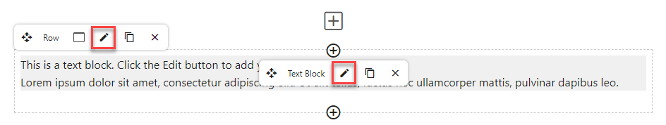
When you open a page that has the Content Block Editor option, the editor will start with one Row with a Text Block already in place. Hover your curser over the sample text, and you will see the outline and options for the Row.
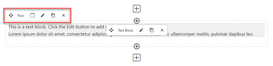
Curser over the middle of the Text Block and you will be presented with the editing options.

Click the pencil icon to edit the Block.

Click the duplication icon to copy the block.

Click the X icon to remove the block.

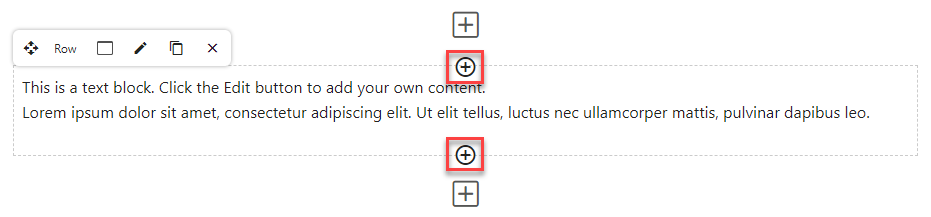
To add a new type of block in the row, you can click the icon. The Block will be added to the top or the bottom of the row, respective of which positioned icon you click.
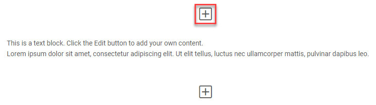
To interact with a Row or Block, hover your cursor over the respective element to show a toolbar. You can click the icon and drag it into place within the editor.
You can also click the icon to duplicate the Row or Block, or the icon to delete it.
Creating and modifying Rows and Columns
When using the Block Editor, your page will be sectioned divided into main sections called Rows. These Rows can be further divided into columns. Blocks can then be nested within each Row of each Column.
To create a new Row, click the icon.
This will open a modal, giving you the option to add a new row, or add a pre-created stack.
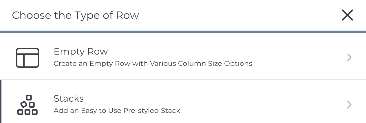 Empty Row
 Empty Row
 This will open a modal, prompting you to select from several types of Rows.
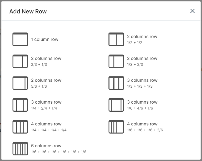
The Row will be added to the above or below the current Row, respective of which positioned icon you click.
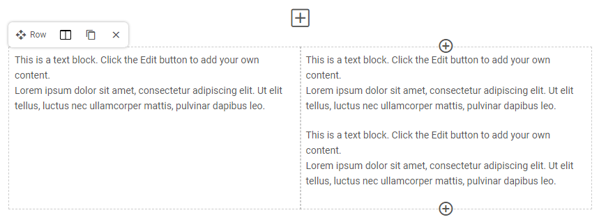
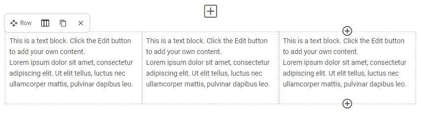 The above image is an example of a Row with Three Columns. The content in each Column can be configured independently.
To change the Column Type of a Row, click the icon shown below. This icon will be different depending on which Column Type is currently being used for the Row.
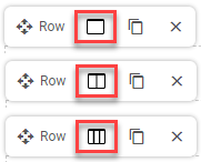 You will not lose content by switching to a row with fewer columns. Switching a Three Column Row to a Two Column Row, for example, will shift the extra block into an existing Column.
Stacks

This will open up a modal for you to select your pre-created stack. Stacks are pre-defined blocks that have already been stacked together to create a template. Each toolkit has it's own Stack option or alternatively you can create a General Stack which can be used anywhere you see the block editor option.

Simply click the Stack you would like to add to your page. Once the Stack is added, you can edit the individual blocks as needed. Any changes you make will only apply to the page you are working on, the original Stack (template) will remain unchanged.
CLICK HERE to learn about Content Stacks.
Style Options for Rows and Blocks
While editing a Row or Block, you'll be able to add various border styles, colors and other customizations. You can do this for all Rows any type of Block - even Empty Space!
 While hovering over a Row/Block, just click the icon. For Rows, you will immediately be directed to the Style Options tab. For Blocks, you'll need to click the Style Options tab.
TIP: In the case of a Single Image Block, the Style Options will be applied to the image and not the entirety of the Block.
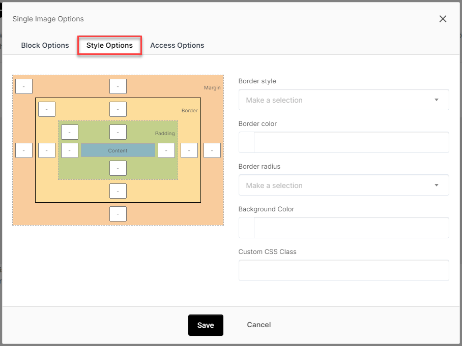
Border Style: If you would like to border your Block space or image, you can choose a style here.
Border Color: Use a Color Picker to apply a color to the border. You can also specify transparency.
Border Radius: You can apply "roundness" to the corners of the area or image using this setting. The higher the number, the rounder the corners will be.
Background Color: You can set the background color of the Block.
Custom CSS Class: For advanced users, you can input your own CSS Class to the Block.
Access Options
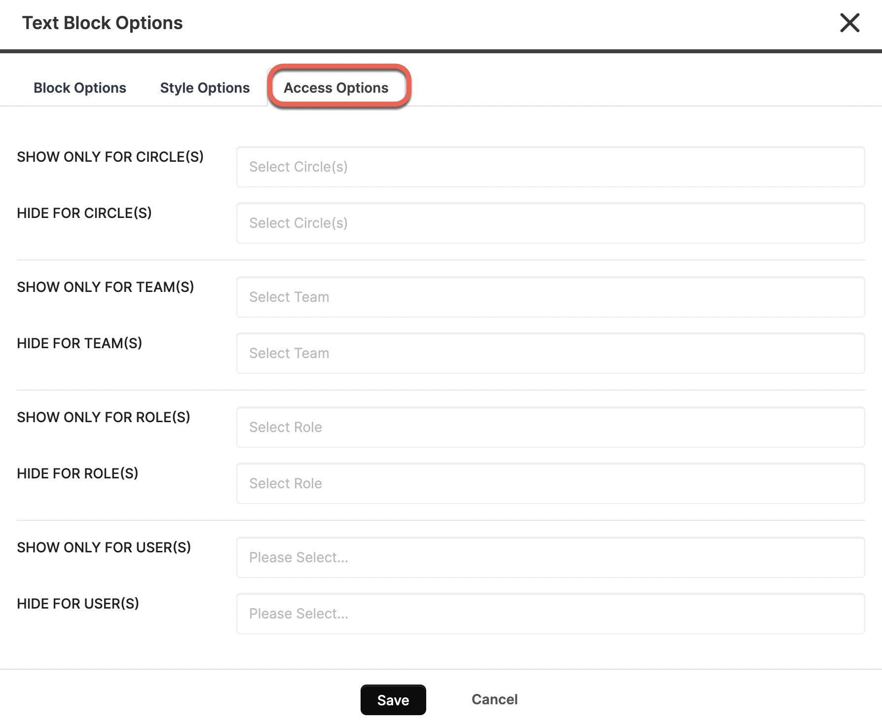
You can set the permissions for each individual Block based on Circles. Teams, Roles, and Users. Only the users specified will be able to view this Block.
You can also choose to hide each individual Block from a specific Circle, Team, Role, or User.
TIP: If a Block is not permissioned for a user, it simply won't be included in the page structure. There is no indication that anything is "missing".
Block Types
Currently, you can choose from:
- Text Block
- Form Block
- Button Block
- Single Image
- Video Block
- Empty Space
- Separator
- Upload Block
- Download Block
- Welcome Block (Dashboard Only)
- Announcements Block (Dashboard Only)
- Chart
- Progress Bar
- CRM Filter Block
- Reporting
- Embed Block
- iFrame Block
- My Tasks Block
- All Tasks Block
- Projects Block
- Activity Stream Block (Dashboard Only)
- My Invoice Block
- Checklist
- Staff Filter Block
...and the list keeps growing!
CLICK HERE to learn about Block Types