
Block Editor Block Types
Block Types
The Content Block Editor has a variety of Blocks to choose from for you to easily build your page.
CLICK HERE to learn about the Content Block Editor
Quick-Nav Menu
Text Block
 A Text block can be used for text, images, videos, pretty much any type of content that you would normally be able to add in a WYSIWYG editor.
Click the icon and select Text Block to add it. To edit the Block, click the icon in the toolbar.
 A modal will appear in which you can edit the content. This will open the Block Options tab.

You can use Dynamic Data Placeholders by clicking the {x} button, and can switch to HTML mode by clicking the <> button.
CLICK HERE to learn about Placeholders
If you are using a Link in your Text Block you can choose to open the link with a built-in preview. This will only work for Files hosted inside of your Portal.

Form Block

A Form Block is used to display a Form that you have created.
Click on the block and click the dropdown to select your Form.

Single Image Block

A Single Image Block is used to display an image of your choice.
Click the icon and select Single Image to add it. To edit the Block, click the icon in the toolbar.

A modal will appear in which you can edit the content. This will open the Block Options tab.
 Image Type: Click the dropdown to reveal the Image type you require

Upload an image: Any image from your own files
URL: Add the URL for your chosen image
Custom Field (File Upload Type): Each Target will see the image that was uploaded to their own Custom Field. Only JPEG, PNG, SVG, GIF, APNG, AVIF, ICO, BMP, WEBP File types can be viewed.
CRM Contact or CRM Company Custom Image: choose to display a custom image from a Dynamic Image Placeholder in your Contact's or Company's profile.
Staff Custom Image and Salesperson Custom Image: This gives you the option to display the custom image for the Salesperson or Coordinator. You can also choose to display the Contact's or Staff's Avatar.
CLICK HERE to learn about Dynamic Image Placeholders
Allow Click Action: Toggle to ON for the ability to click on the image to trigger an action such as navigating to other areas of the Platform, navigating to a URL or triggering an Auto-Template.
Full Width: Toggle to ON for the image to automatically expand to the full size of the Block.
If you'd like to manually set the dimensions, set the toggle to OFF and input values in the Width and Height fields.
Edge to Edge: Toggle to ON to Force the image to fill the browser width from edge to edge. This still allows for customization of image style and alignment.
Image Style: Keep the image as-is, or apply a circular cutout effect by using the dropdown menu.
Alignment: Alight the image to the center, left or right of the Block.
Empty Space Block
 An Empty Space Block can be used to space out your content. You can apply styling to it to make it more of a visual separator.
Click the icon and select Empty Space to add it. To edit the Block, click the icon in the toolbar.

A modal will appear in which you can edit the content. This will open the Block Options tab.

Set the pixel height of the Block.
Horizontal Separator Block

A Separator Block makes it easier to divide your content into sections.
Click the icon and select Separator to add it. To edit the Block, click the icon in the toolbar.

A modal will appear in which you can edit the content. This will open the Block Options tab.
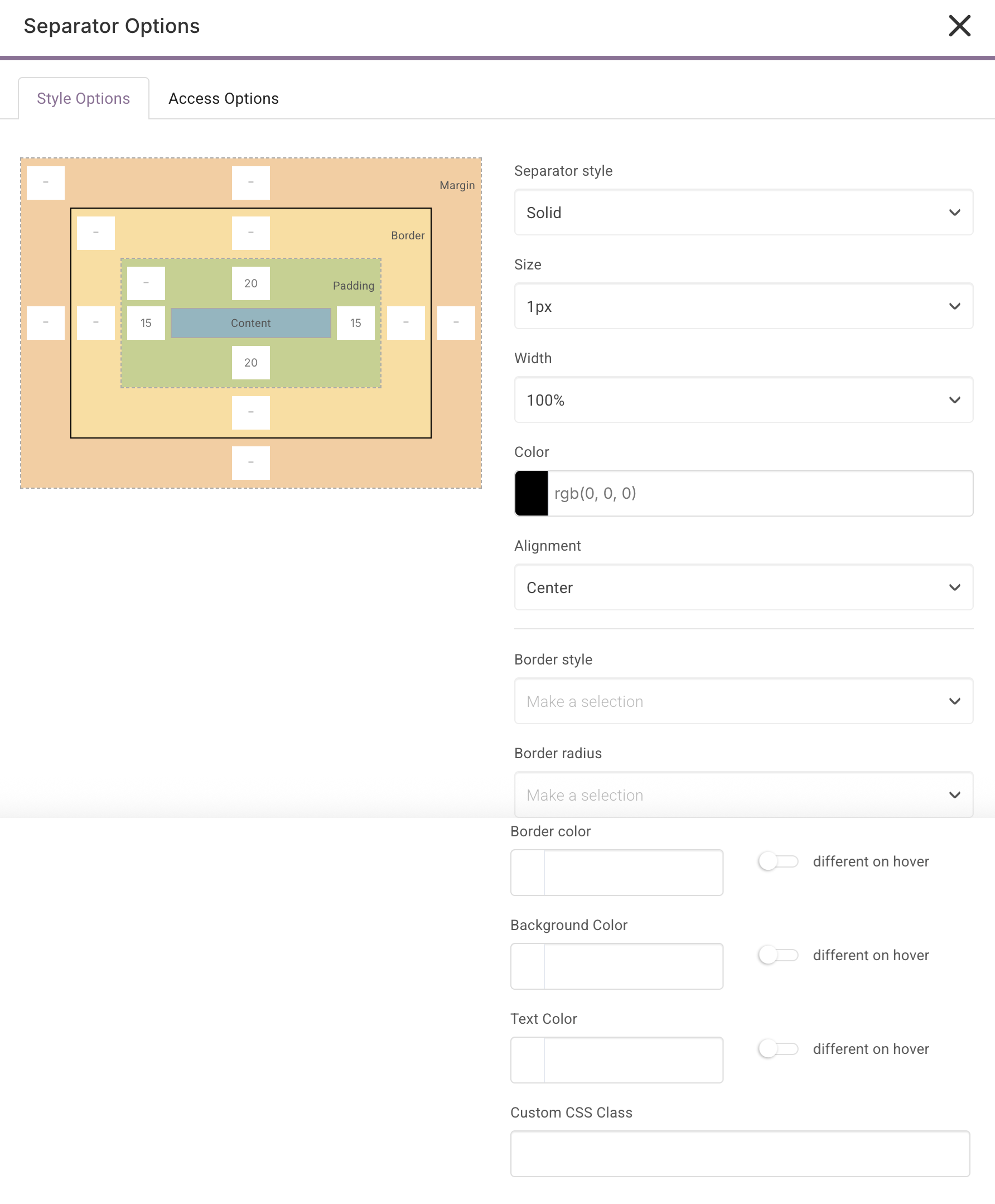
Separator Style: Choose the type of separator line that will be used.
Size: Choose the pixel height of the line.
Width: You can set width of the line by percentage.
Color: Use the Color Picker to set the color of the line. You can also set transparency.
Alignment: Align the separator to the center, left, or right of the Block.
Border Style: Add the style of of the Border around the Block.
Border Radius:Choose the border radius from None to 35 px.
Border color: Add a color for your border.
Background Color: This will be the block color.
Text Color: Set your border text color.
Custom CSS Class: Apply your CSS to add further customization.
iFrame Block

An iFrame Block can be used to embed content within an Inline Frame. It basically acts as a secondary webpage within your main page.
Click the icon and select iFrame Block to add it. To edit the Block, click the icon in the toolbar.

A modal will appear in which you can edit the content. This will open the Block Options tab.

Source Type: Choose between URL or Custom Field URL. For URL, you can paste the direct link into the Embed URL field. For Custom Field URL, you will need to choose the Custom Field from the dropdown menu. You'll need to create them first. At this time, you can choose from CRM-Company, CRM-Contact, and Staff Custom Fields.
CLICK HERE to learn about URL Custom Fields
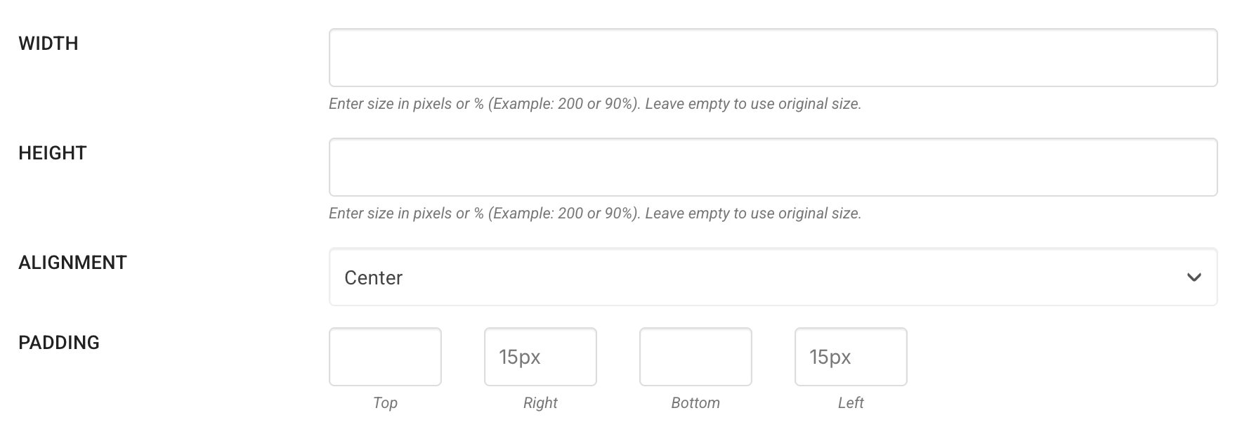
Full Width: Toggle to ON for the content to automatically expand to the full size of the Block.
If you'd like to set the dimensions manually, set the toggle to OFF and input values in the Width and Height fields.
Alignment: Align the content to the center, left or right of the Block.
Embed Block

An Embed Block can be used to embed documents, videos, and interactive media.
Click the icon and select Embed Block to add it. To edit the Block, click the icon in the toolbar.

A modal will appear in which you can edit the content. This will open the Block Options tab.

Embed Code: Paste the embed code into this field. Embed code is code that is generated by a third-party website for you to use.
Alignment: Align the content to the center, left or right of the Block.
Video Block
 A Video Block can be used to embed videos.
Click the icon and select Video Block to add it. To edit the Block, click the icon in the toolbar.

A modal will appear in which you can edit the content. This will open the Block Options tab.

Video Source: Choose between YouTube, Vimeo or Self Hosted. Please note for Self Hosted Videos there is a FREE Tier available to Members. Additional Storage/Streaming minutes available on higher tier plans accessed through the Hosted Video Subscription Service.
If you choose Self Hosted, you upload file or select it from the Media Library and then add your preferred options as shown below.

CLICK HERE to learn more about the Hosted Video Subscriptions.
Source Type: For YouTube and Vimeo videos, you can choose between URL or Custom Field URL. For URL, you can paste the direct link into the Embed URL field. For Custom Field URL, you will need to choose the Custom Field from the dropdown menu. You'll need to create them first.
URL: The direct URL to the video you want to embed.
Full Screen: Allow the video to play in Full screen mode.
Full Width: Toggle to ON for the content to automatically expand to the full size of the Block.
If you'd like to manually set the dimensions, set the toggle to OFF and input values in the Width and Height fields.
Alignment: Align the content to the center, left or right of the Block.
Button Block
 A Button Block can be used to create a clickable button that directs you to a different page (within the platform or an external page), or opens a widget for the user to interact with.
Click the icon and select Button Block to add it. To edit the Block, click the icon in the toolbar.

A modal will appear in which you can edit the content. This will open the Block Options tab.

Button Text: The text that will appear on the button.
Click Action: Set what happens when the user clicks on the button in this Block.
- Navigate to Direct or Relative URL: Direct the user to an external source or to a static area inside of the platform.
- Navigate to URL from Custom Field: Direct the user to the data provided from a URL Custom Field, which can be unique for each user.
- Placeholder Link: Direct the user to an area within the platform using a dynamic link, which will be unique depending on which user is logged in.
- Navigate to Portal Page: Direct the user to a particular Portal Page.
- Open Appointment Scheduling Pop-up: This will open the Appointment Scheduling widget, which the user can use to book an Appointment.
- Navigate to [Platform Area]: You can select from an extensive list of areas of the platform to direct the user to, such as "History of Payments", "Send New Message", etc.
- Forms > Staff Submit: You can select from a dropdown with a list of all active Forms. When the button is clicked this will redirect the User to the Staff Submit Form page for the selected Form.
CLICK HERE to learn about URL Custom Fields
CLICK HERE to learn about Placeholder Links
Auto-Template: When toggled on you will be able to select a pre-configured Auto-Template from the dropdown. You have the option to include a Success Message that will appear when this menu item is clicked. You can also limit the number of triggers/clicks and determine what to do once that limit has been reached.
Open New Tab: Choose whether or not you would like the page to be opened in a new tab. This is recommended if references will still need to be made to the origin page.
Width: Set how wide the button will appear.
Height: Set how tall the button will appear.
Alignment: Align the button to the center, left, or right of the Block.
IMPORTANT: When choosing a Portal Page as the link, the user will automatically be assigned to that page if they are not already. You can also choose to quickly create a new Portal Page to link to, in which case the assignments as well as the Category / Menu Group will be copied and applied.
Chart Block

A Chart Block lets you create a visual representation of data in charts and graphs.
Click the icon and select Chart to add it. To edit the Block, click the icon in the toolbar.

A modal will appear in which you can edit the content. This will open the Block Options tab.

Title: You can optionally include a title to be shown above the chart.
Chart Type: Choose to display your data in one of several types of charts.
Values: Reorder, edit, duplicate, or delete the data points for your chart to display. Click the +Add New Value button to create a new one.
Click the icon to configure the value. You can change its label, number value and color. You can also choose to manually input a number value, or pull the data from a Number Type Custom Field.

CLICK HERE to learn about Custom Fields

Width: Set how wide the chart will appear.
Height: Set how tall the chart will appear.
Alignment: Align the chart to the center, left or right of the Block.
Progress Bar Block

A Progress Bar Block lets you create progress bars, which are a visual representation of progression.
Click the icon and select Progress Bar to add it. To edit the Block, click the icon in the toolbar.

A modal will appear in which you can edit the content. This will open the Block Options tab.

Title: You can optionally include a title to be shown above the progress bar(s).
Values: Reorder, edit, duplicate, or delete the data points for your progress bars to display. Click the +Add New Value button to create a new one.
Click the icon to configure the value. You can change its label, number value and color. You can also choose to manually input a number value, or pull the data from a Number Type Custom Field.
CLICK HERE to learn about Custom Fields
 Completed Value: The number you enter here will determine what constitutes a full bar. For example, 50/100 would be half of the bar, while 50/500 would only be a tenth of the bar.
Show Value: By default the progress bar(s) will not reveal the current value that determines its progress. You can choose to display the value, as well optionally choose a unit to accompany it (such as #, /100, etc.)
Progress Type: Choose to display your progress bar in a straight line, or an arc (doughnut-shape).
Progress Styles: You can spice up your progress bars by applying a stripe effect. You can also choose to animate the stripes moving left or right.
Label Styles: Configure the color, style, and size of the font of the text that appears inside of the progress bar(s). You can also choose to make the text bold.
If you have progress bars in multiple colors, inverting the label color can help to make the text readable if you choose to invert the colors. This will override the font color setting.
Width: Set how wide the progress bars will appear.
Height: Set how tall the progress bars will appear.
Alignment: Align the progress bars to the center, left or right of the Block.
Padding: Add padding around your content.
My Invoices Block

The My Invoices Block enables you to show the Target their invoices based on settings configured on the individual Block.
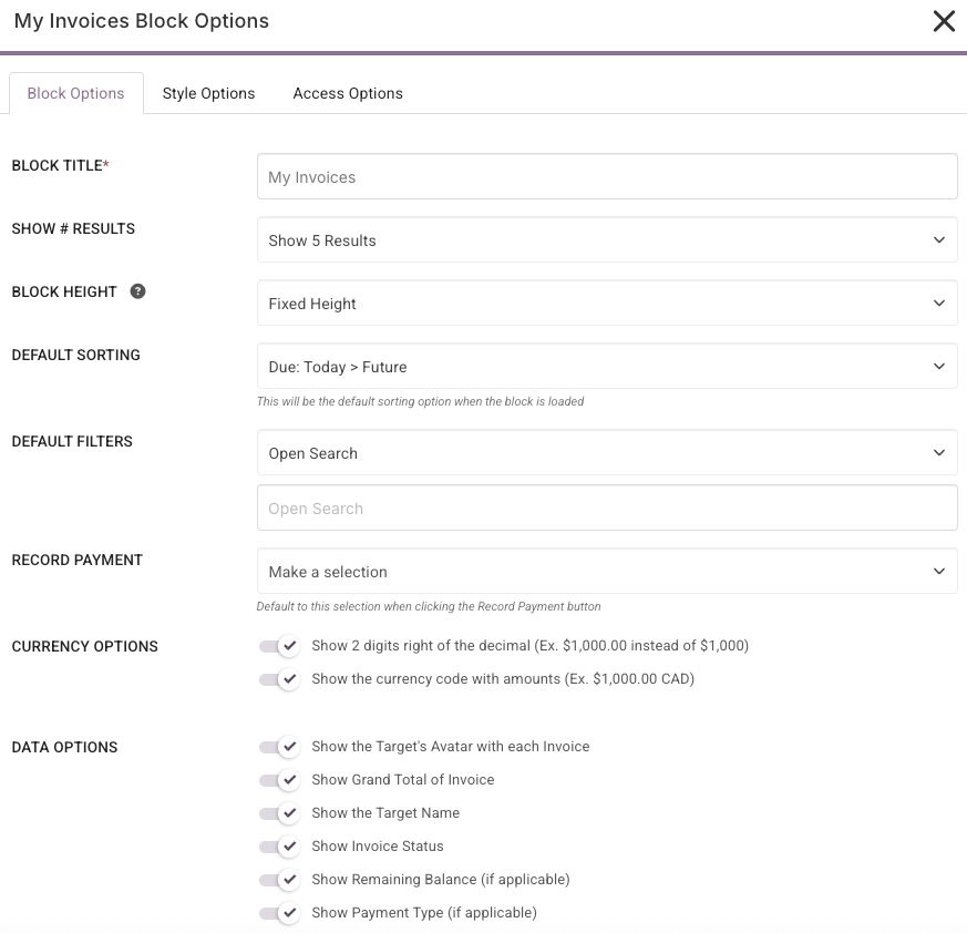
Block Title: Give your My Invoice Block a unique title. This title will show on the Target's side as a header.
Show # Results: Set the number of invoices to show in the block. You can choose from 5, 10, 15, or 20.
Block Height: Choose between Fixed Height (standard block size), Auto Height (the block will re-size to the number of results you have selected) or Custom Height (you select the specific number of px you would like to use).
Default Sorting: This option sets the default sorting of the Block when the Block is loaded. Do not worry, you can change between any of the sorting options while viewing the Block by clicking the  icon. You can choose from Due Date Ascending, Due Date Descending, Status (Open-Draft), Status (Draft-Open), Target Name (A-Z), or Target Name (Z-A).
Default Filters: Here you can set the default filter that is used when the Block is loaded. Do not worry, you can change between any of the filter options while viewing the Block by clicking the  icon. You can choose from Open Search, Due Date, Before Due Date, After Due Date, Due Date Range, Statuses, and Client. You can also pre-define a filter within the search categories.
Record Payment: Default to this selection when clicking the Record Payment button.
Currency Options: Your currency options are to add 2 digits right of the decimal and the option to add the currency code.
Data Options: Toggle the data options you wish the Target to view from the Dashboard.
This block can be used for Clients and also used for Staff Roles who have access to invoicing.
The Client can click the invoice details to be taken to the invoice in question or they can click the VIEW ALL INVOICES button to see their full invoice list.

Any Staff member with Invoice permissions has the ability to see draft, open and closed invoices if required. The Staff member can click the invoice details to view the invoice, or record a payment method against the invoice.

The Invoice Block is only available on a Dashboard or Portal Page.
My Tasks Block

The My Tasks Block enables you to show the target their Tasks based on settings configured on the individual Block.

The My Tasks Widget can be used for all Clients and Staff Roles. The Target can click the task to view the individual Task, click the check to complete a Task, view and upload Task Files, and update the Task, all without leaving the page!
The My Tasks Block is only available on Dashboards and Portal Pages.
How do I configure the My Tasks Block settings?
When you add the Block to a content page you will be presented with multiple setting options.
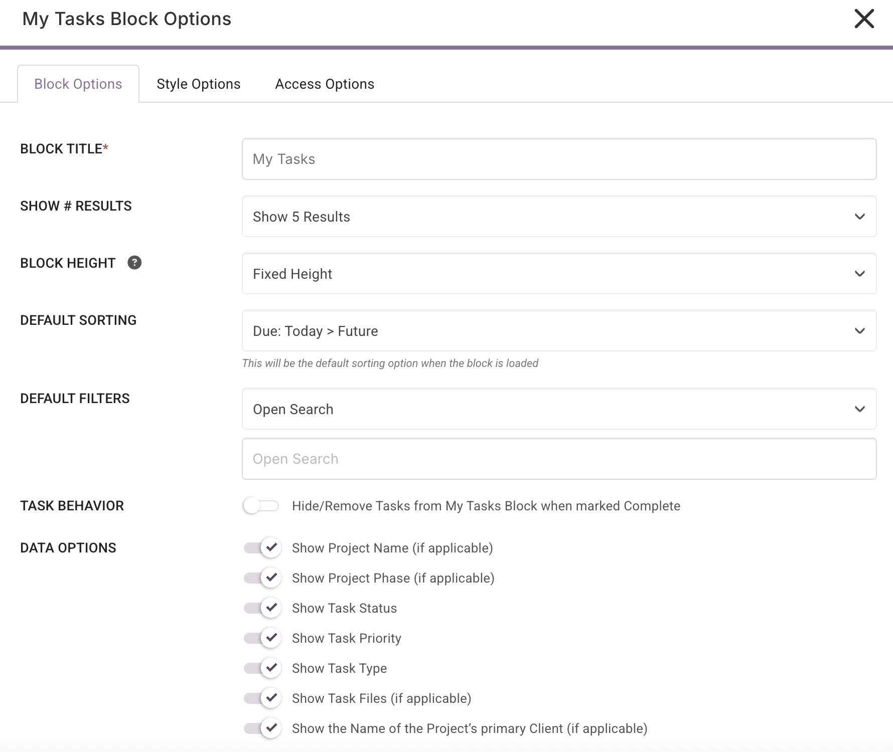
Block Title: Give your My Tasks Block a unique title. This title will show on the Target's side as a header.
Show # Tasks: Set the number of Tasks to show in the block. You can choose from 5, 10, 15, or 20.
Block Height: Choose between Fixed Height (standard block size), Auto Height (the block will re-size to the number of results you have selected) or Custom Height (you select the specific number of px you would like to use).
Default Sorting: This option sets the default sorting of the Block when the Block is loaded. Do not worry, you can change between any of the sorting options while viewing the Block by clicking the icon. You can choose from Due Date Ascending, Due Date Descending, Status (Open-On Hold), Status (On Hold-Open), Priority (Low-Ready for Deploy), Priority (Ready for Deploy-Low), Project's Client Name (A-Z), or Project's Client Name (Z-A).
Default Filters: Here you can set the default filter that is used when the Block is loaded. Do not worry, you can change between any of the filter options while viewing the Block by clicking the icon. You can choose from Open Search, Due Date, Before Due Date, After Due Date, Due Date Range, Statuses, and Priority. You can also pre-define a filter within the search categories.
Task Behavior: The "Hide/Remove Tasks from My Tasks Block when marked Complete" option, when enabled, will remove any Completed Tasks from the view. When disabled, any Completed Tasks will be shown in the view and will be shown as Completed.
Data Options: The following settings will customize the data that is shown per Task in the form of text or icons.
- Show Project Name (if Applicable): When enabled, the Project Name will be shown above the Task Name if the Task is associated with a Project. When disabled, the Project Name will not be shown on the Block.
- Show Project Phase (If Applicable): When enabled, the Phase will be displayed below the Task Name if a Phase is assigned to the Task. When disabled, the Phase will not be shown on the Block.
- Show Task Status: When enabled, the Task Status will be shown below the Task Name. When disabled, the Status will not be shown on the Block.
- Show Task Priority: When enabled, the Task Priority will be shown below the Task Name. When disabled, the Task Priority will not be shown on the Block.
- Show Task Type: When enabled, the Task Type will be shown below the Task Name. When disabled, the Task Type will not be shown on the Block.
- Show Task Files (if Applicable): When enabled, the Task Files option will open which enables the Target to view, download, and upload files to the Task. When disabled, the Files option will not show in the Block.
- Show the Name of the Project Primary Client (If Applicable): When enabled, the Primary Client's name will be displayed above the Task Name if applicable. When disabled, the Primary Client's name will not be shown on the Block.
Once the Task Block is enabled, the Target will have the ability to click the task to open the Task window. From here the target can work on the task without leaving the Dashboard/Portal Page.

All Tasks Block
The All Tasks Block provides a centralized location for Super Admin, Admin and Project Managers to see all Tasks. This eliminates the need to navigate and cycle through individual Projects.

Please note: Super Admins can see all Tasks, while Admin and Project Manager roles can see all Tasks/Project Tasks that they are assigned to.
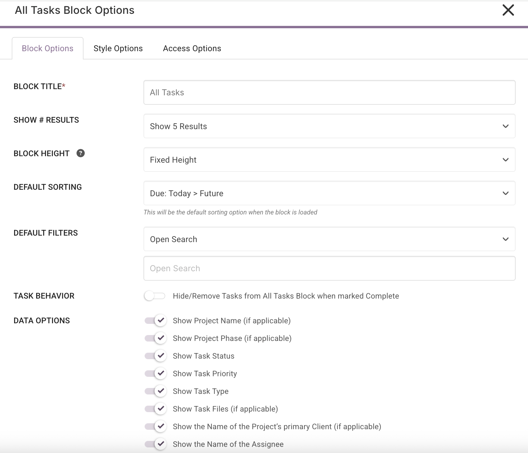
Block Title: Give your All Tasks Block a unique title. This title will show on the Target's side as a header.
Show # Tasks: Set the number of Tasks to show in the block. You can choose from 5, 10, 15, or 20.
Block Height: Choose between Fixed Height (standard block size), Auto Height (the block will re-size to the number of results you have selected) or Custom Height (you select the specific number of px you would like to use).
Default Sorting: This option sets the default sorting of the Block when the Block is loaded. Do not worry, you can change between any of the sorting options while viewing the Block by clicking the icon. You can choose from Due Date Ascending, Due Date Descending, Status (Open-Follow Up), Status (Follow Up-Open), Priority (Low-Urgent), Priority (Urgent-Low), Project's Client Name (A-Z), or Project's Client Name (Z-A), Assignee Name (A-Z), Assignee Name (Z-A).
Default Filters: Here you can set the default filter that is used when the Block is loaded. Do not worry, you can change between any of the filter options while viewing the Block by clicking the icon. You can choose from Open Search, Due Date, Open Search, Statuses, Client. You can also pre-define a filter within the search categories.
Task Behavior: The "Hide/Remove Tasks from My Tasks Block when marked Complete" option, when enabled, will remove any Completed Tasks from the view. When disabled, any Completed Tasks will be shown in the view and will be shown as Completed.
Data Options: The following settings will customize the data that is shown per Task in the form of text or icons.
- Show Project Name (if Applicable): When enabled, the Project Name will be shown above the Task Name if the Task is associated with a Project. When disabled, the Project Name will not be shown on the Block.
- Show Project Phase (If Applicable): When enabled, the Phase will be displayed below the Task Name if a Phase is assigned to the Task. When disabled, the Phase will not be shown on the Block.
- Show Task Status: When enabled, the Task Status will be shown below the Task Name. When disabled, the Status will not be shown on the Block.
- Show Task Priority: When enabled, the Task Priority will be shown below the Task Name. When disabled, the Task Priority will not be shown on the Block.
- Show Task Type: When enabled, the Task Type will be shown below the Task Name. When disabled, the Task Type will not be shown on the Block.
- Show Task Files (if Applicable): When enabled, the Task Files option will show allowing the Target to view, download, and upload files to the Task. When disabled. the Files option will not show in the Block.
- Show the Name of the Project's Primary Client (If Applicable): When enabled, the Primary Client's name will be displayed above the Task Name if applicable. When disabled, the Primary Client's name will not be shown on the Block.
- Show the Name of the Assignee: You can see who the task owner is when this is enabled.
Projects Block
 A Projects Block enables you to automatically display the Projects that are assigned to the logged-in user based on the settings configured in the block.

The Projects Block is a powerful way to consolidate and organize Project access in one convenient view. It offers direct links to key Project areas such as Files, Kanban Board, Notes, Timers, and the Calendar.
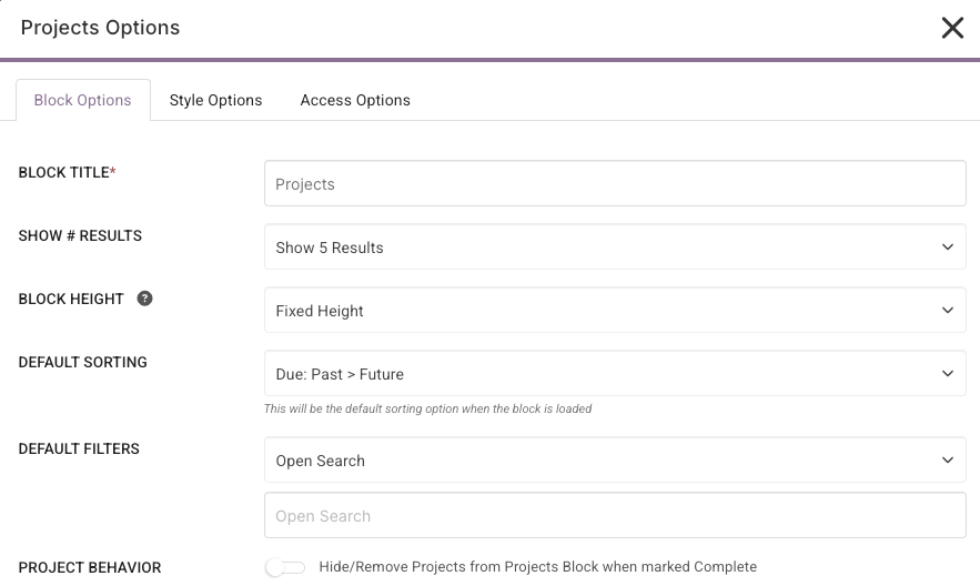
Block Title: Give your All Tasks Block a unique title. This title will show on the Target's side as a header.
Show # Projects: Set the number of Projects to show in the block. You can choose from 5, 10, 15, or 20.
Block Height: Choose between Fixed Height (standard block size), Auto Height (the block will re-size to the number of results you have selected) or Custom Height (you select the specific number of px you would like to use).
Default Sorting: This option sets the default sorting of the Block when the Block is loaded. Do not worry, you can change between any of the sorting options while viewing the Block by clicking the icon. You can choose from Due: Past > Future, Due: Future> Past, Due: Today > Future, Due: Today > Past, Status (Pending-Completed), Status (Completed-Pending), Project Name (A-Z), Project Name (Z-A), Project's Client Name (A-Z), Project's Client Name (Z-A), Project's Leader Name (A-Z), Project's Leader Name (Z-A).
Default Filters: Here you can set the default filter that is used when the Block is loaded. Do not worry, you can change between any of the filter options while viewing the Block by clicking the icon. You can choose from Open Search, Due Date, Statuses, Business Sector, Client or Project leader. You can also pre-define a filter within the search categories.
Project Behavior: When the "Hide/Remove Projects from Projects Block when marked Complete" is enabled, it will remove any Completed Projects from the view. When disabled, any Completed Tasks will be shown in the view and will be shown as Completed.
Data Options For Staff: You can choose which data points appear in the Block such as Client Name, Client Company, Percent Completed, and more. This allows you to tailor visibility based on each Staff role. For instance, if you’re working with freelancers, you might choose to hide Client details to keep the view focused and distraction-free.

Data Options for Client: Visibility is controlled by settings within each individual Project. These granular visibility options allow you to fine-tune exactly what the Client sees in their Projects Block, ensuring that information is displayed in a way that aligns with your workflow and communication strategy.

Announcements Block

This Announcement Block shows any announcements that you have created for a Role, Circle, Team, Company or Individual. Each Target will only see the Announcements that are relevant to them.

The Announcement Block is only available on a Dashboard.
CLICK HERE to learn about Announcements
Activity Stream Block

The Activity Stream Block shows a time-stamped log of events that have occurred within the platform and is for internal use only.
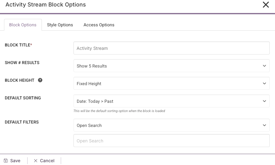
The Activity Block enables you choose how many of the most recent events are to be shown and you can limit access by using the Access Options tab.
Block Title: Give your Block a unique title. This title will show on the Target's side as a header.
Show # Results: Set the number of Projects to show in the block. You can choose from 5, 10, 15, or 20.
Block Height: Choose between Fixed Height (standard block size), Auto Height (the block will re-size to the number of results you have selected) or Custom Height (you select the specific number of px you would like to use).
Default Sorting: This option sets the default sorting of the Block when the Block is loaded. Do not worry, you can change between any of the sorting options while viewing the Block by clicking the icon. You can choose from Date: Today > Past, Date: Past > Today, User (A-Z), User (Z-A), Section (A-Z), Section (Z-A).
Default Filters: Here you can set the default filter that is used when the Block is loaded. Do not worry, you can change between any of the filter options while viewing the Block by clicking the icon. You can choose from Open Search, User, Section, Date Range.
The Activity Stream Block is only available on a Dashboard.
CLICK HERE to learn about the Activity Stream
Welcome Block

A Welcome Block is used to create a Dashboard welcome message.

You can use one of the provided images or upload your own image as well as use the default message or customize your own message using the Content Editor.
The Welcome Block is only available on a Dashboard.
Upload Block

The Upload Block enables easy uploading of files to pre-determined file locations.
You can create a Title, Subtitle and Description for each Upload Block (this will be visible on the Targets Dashboard). Toggle the button if you want to allow multiple files to be uploaded.

Now select the Upload Location.
 If you want the uploaded file to be placed in the Users Folders, select the Parent Folder From the User-Specific Dynamic Path.
 TIP: If you have a specific Folder you would like the file to be uploaded to, you can add the Destination Folder Path i.e. add the Folder Name. After '/' in the Destination Folder Path, just add the Folder Name. The File will be automatically added into an existing Folder of the same name or it will create a new Folder if one is not present.
In this example, in the Contact's 'Uploaded by...' Folder we created another folder called 'Upload From Dashboard' so we added the folder name as follows;
 Alternatively, you can use or create a Folder in the Target's File Cabinet (Upload Folder).

You also have the option to add the File upload to your Organization's Global File Cabinet. To create a New Global File Cabinet, add the Folder Name and click create.

To select an Existing File Cabinet Folder, click the down arrow and reveal your existing folders.
 Each time files are uploaded to a Global File Cabinet a new Folder will be created and uniquely named.
Download Block

The Download Block enables easy downloading of files from pre-determined file locations.
You can create a Title, Subtitle and Description for each Download Block (this will be visible on the Targets Dashboard). Toggle the button if you want to Show Navigation.

Now select the Location of the Files to be downloaded.
TIP: If you have a specific Folder that the file is contained in, you can add the Destination Folder Path i.e. add the Folder Name. By doing this the Folder will be visible to the Target not the full 'Uploaded by' Folder.

If you are wanting the target to download a File from a User-Specific location, select User-Specific Dynamic Path and choose Uploaded by or Target File Cabinet from the Parent Folder options.
 In this example, in the Contact's 'Uploaded by...' Folder we added the destination Folder Path called 'Resources' which is housing the Files to be downloaded;

If the files for download are being housed in the Target's File Cabinet (Download Folder) you can select 'Target File Cabinet'. You can also add the Destination Folder Path if your files for download are being housed in a Folder within the File Cabinet.

Alternatively, You also have the option to add the File/s for download to your Organization's Global File Cabinet.

To create a New File Cabinet Folder, select the option to Create New File Cabinet Folder and add your Folder Name.
 For and existing File Cabinet Folder an Add Files button will appear for you to add the relevant File.
 When creating a new File Cabinet Folder, you will need to name your Folder and click the Create Button then click the Add Files button to add the relevant File/s.
Reporting Block

The Reporting Block is only visible to Super Admin and Admin Users. Select the information you are wanting to show.

Tick the Content you would like to show and then click the dropdown arrow to add your preferred settings.

CRM Filter Block

You can add one or more CRM Filter Blocks to a Dashboard, and set each one uniquely to display all the Contacts that match your configured settings for that particular Block.
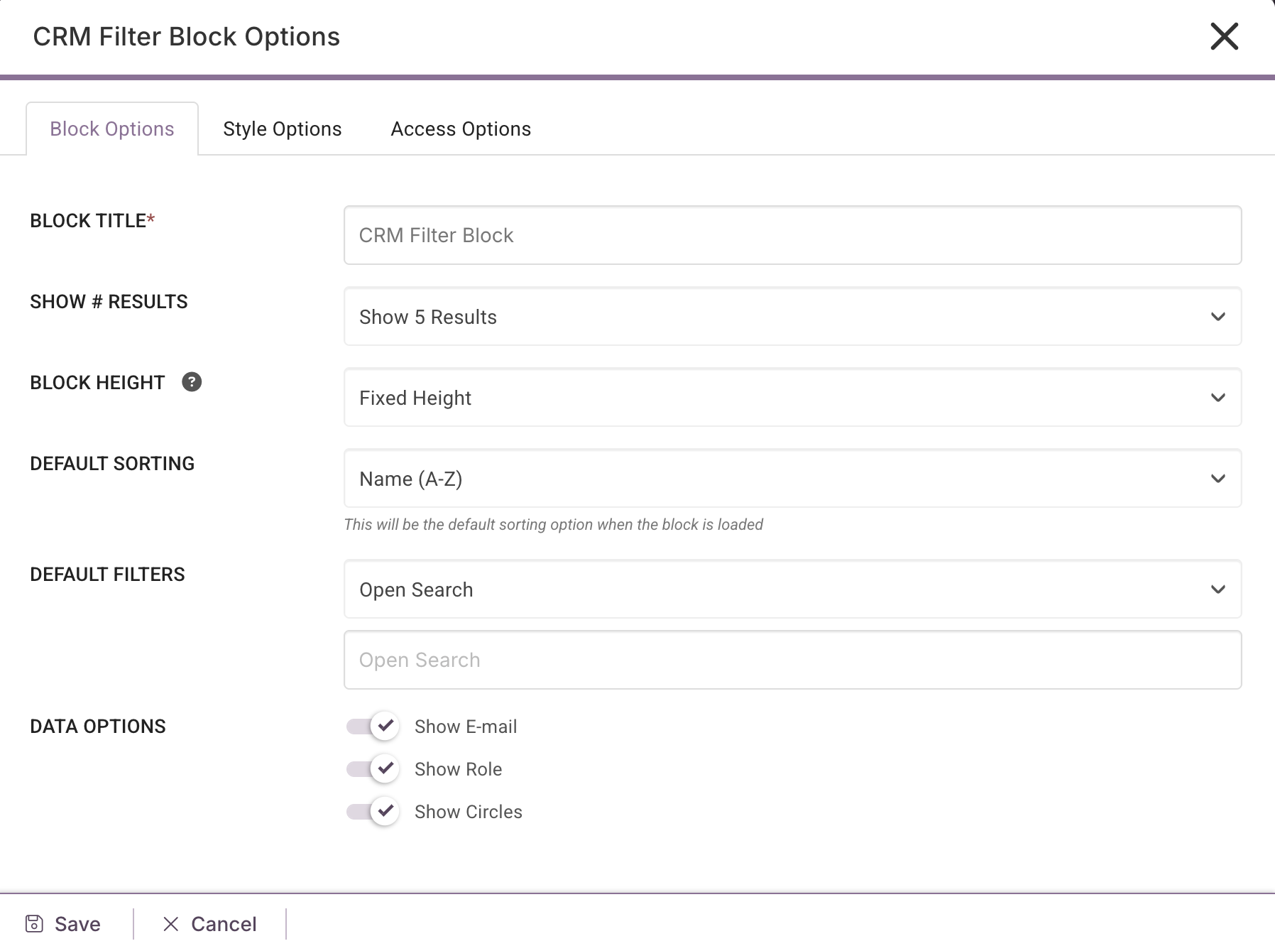
Block Title: Name the Block. You can have multiple CRM Filter Blocks on one Dashboard if required.
Show Results: You can choose to show 5, 10, 15 or 20 results.
Block Height: Choose between Fixed Height (standard block size), Auto Height (the block will re-size to the number of results you have selected) or Custom Height (you select the specific number of px you would like to use).
Default Sorting: Name (A-Z), Name (Z-A), Last Login Ascending or Last Login Descending.
Default Filters: Segment by Role, Circle, Tag, Deal Stage(s), Last Login Date and From/To Last Login. This will give you real-time visibility as to which Contacts are currently in which position in your workflow/funnel.

Data Options: You can choose to show E-mail, Role and Circles.

By default, the access for a Contact Block will be set to Super Admin & Admin however, you can change the access by going to the Block Access tab to add or remove your chosen roles. Please note, only Staff Roles with CRM access will be able to view the block, and Salespeople will only be able to view their own 'Claimed' and any unclaimed Contacts.
What does the Staff member see?
The Staff member will be able to see Company and Contact information as shown below;
 You can search for a Contact/Company in the search bar on the right of the block. Each Company/Contact card can show all of the Circles the Company/Contact has been assigned and you have the ability to impersonate, send a message or quickly navigate to the CRM Dashboard using the icons on the right of the card.
Checklist Block

Pre-created Checklists can be added to the Dashboard for your Prospects, Clients and Staff members to complete. Multiple Checklist blocks can be added to the Dashboard or Portal Page.
CLICK HERE to learn more about Checklists
Staff Filter Block

The Staff Filter Block enables you to easily view which Staff members are in which position or team, offering instant insights into your organization’s structure.
Tailor your Dashboards to display exactly what you need by using an Open view of your Staff members or segment them by Role(s), Team(s), or Login Status or Login Date.
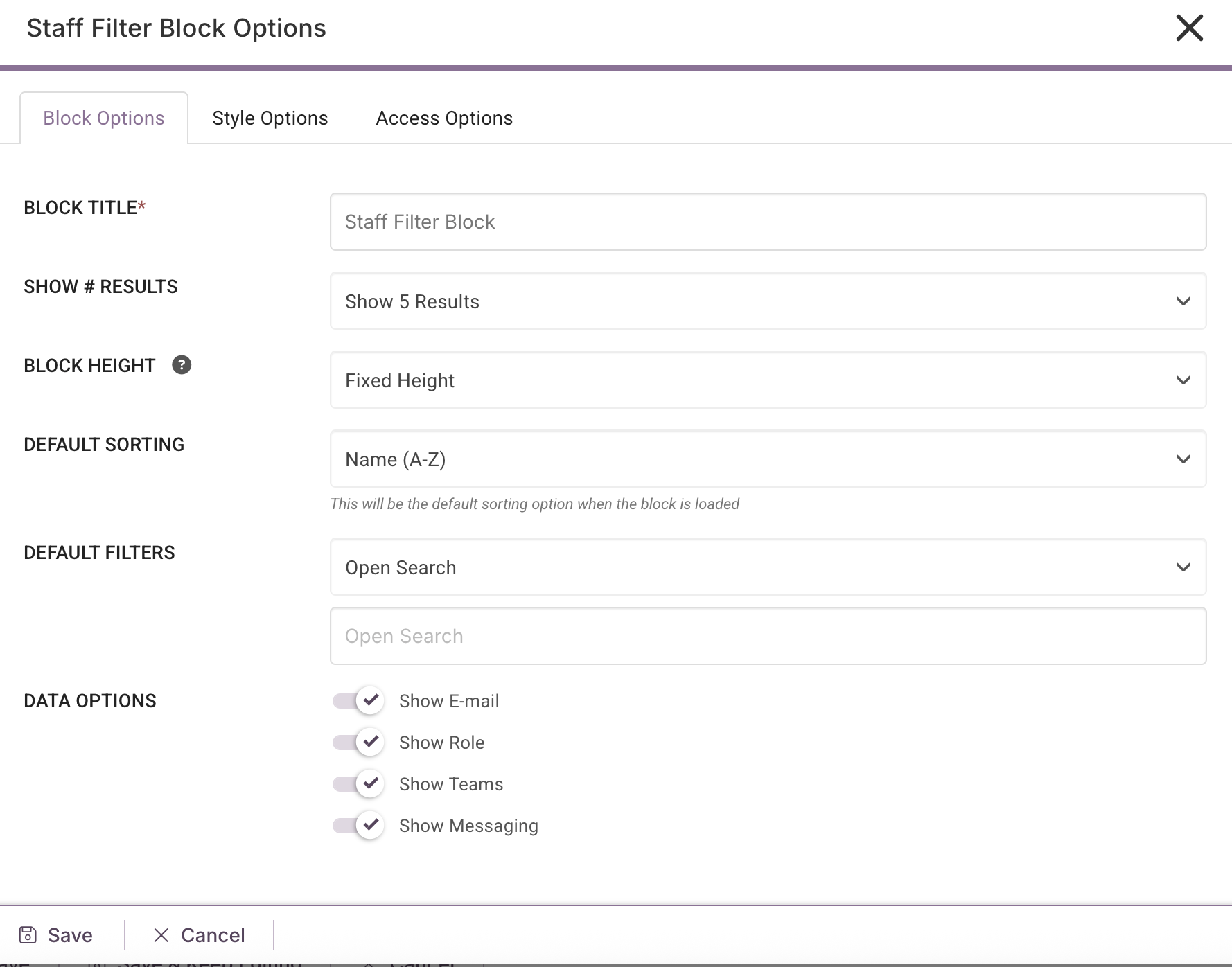
Once you select your filter, you can then choose the data option(s) you would like to display.

You can Impersonate, message and edit the profile by using the right side icons for each staff member on the block.